Fortimize
Client: Fortimize Inc.
Role: Creative Director, Brand Designer
Fortimize is a SaaS company specializing in Salesforce implementation for financial and real estate institutions. I was tasked with refreshing the brand and bringing it more in line with the values of the company. Everything from colors to illustration styles, slide decks and social was rebranded. 
Right arrow to go to next page
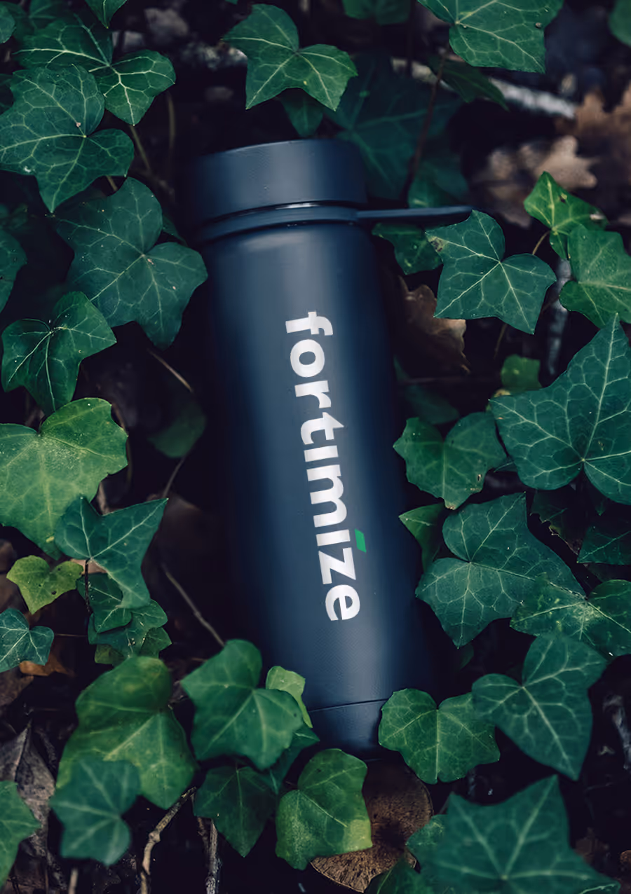
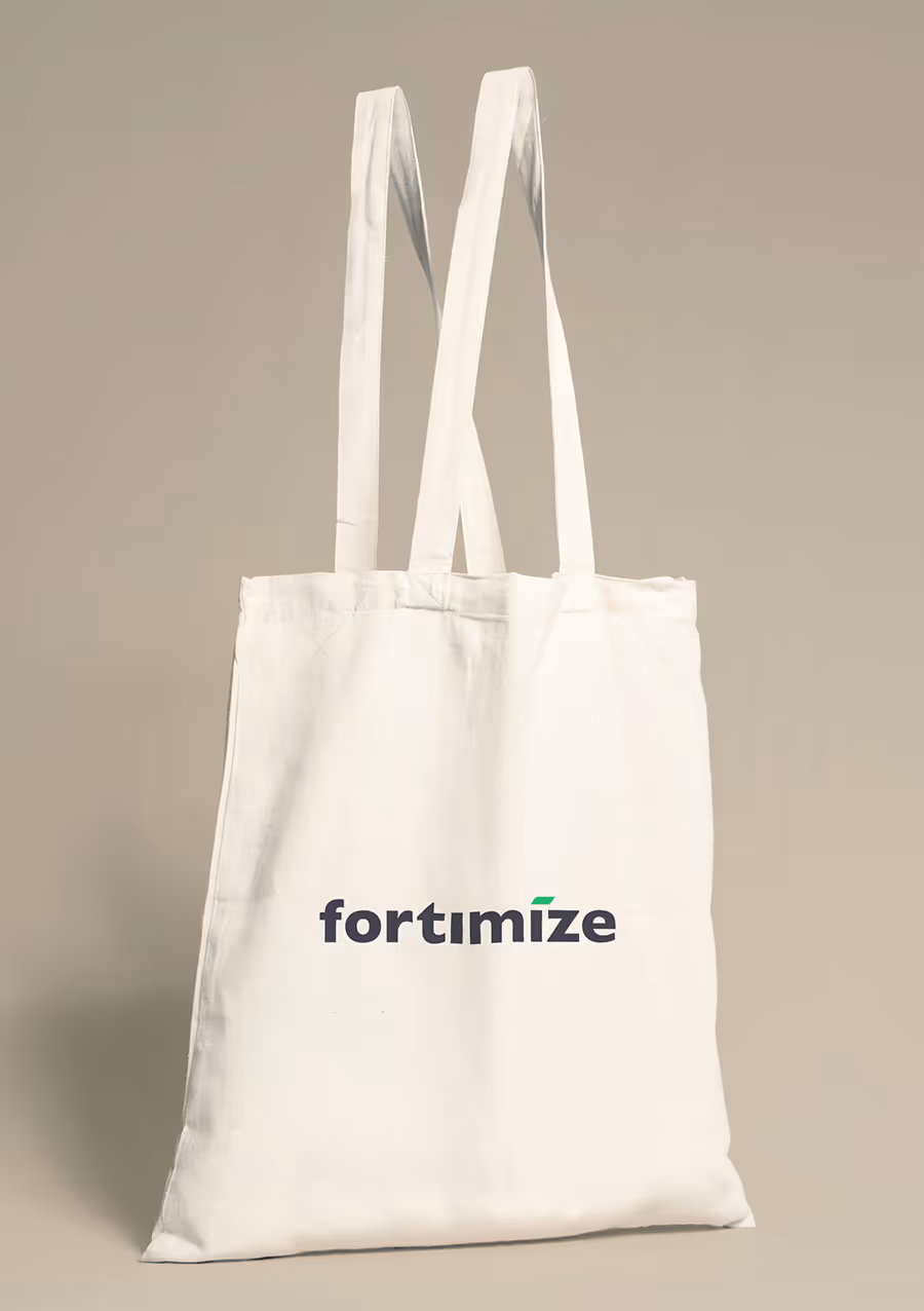
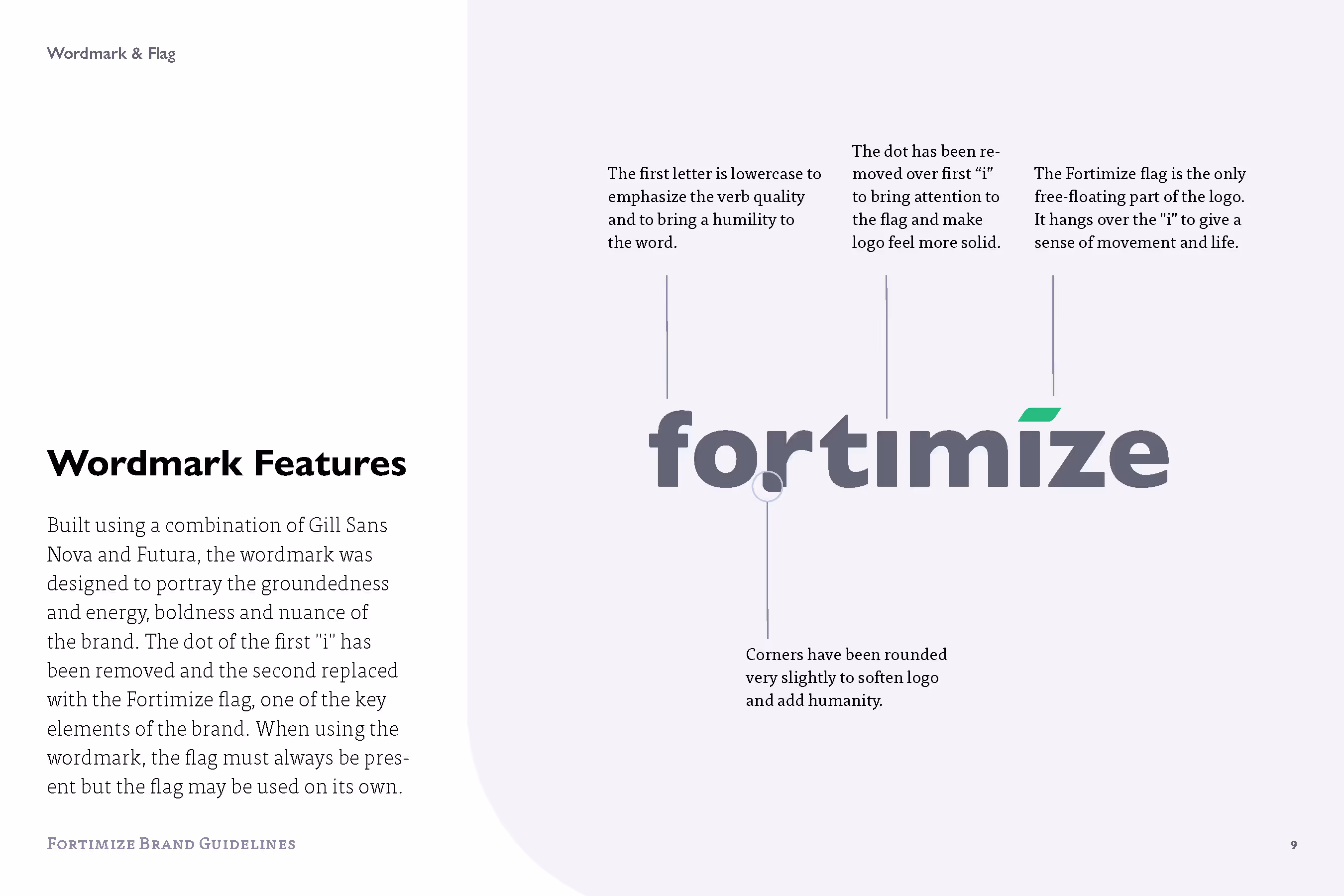
As a company that valued relationships, one of the primary concerns was to humanize the brand while still showing it was on the forefront of technology. After exploring various symbols we settled on a simple word mark based on Gill Sans, all lowercase to give it a sense of simplicity, uniformity, and approachability, replacing the dot of the “i” with a leaf-like symbol that could frame images or provide ambient curvature. 
For the colors, we settling on an earthy palette of terracotta tans, slate greys, and mossy greens as base colors, with a splash of verdant, energetic green to show that the company was both grounded in reality while also being dynamic and forward thinking. The palette was both calming and lively and is still one of my favorite aspects of the brand.