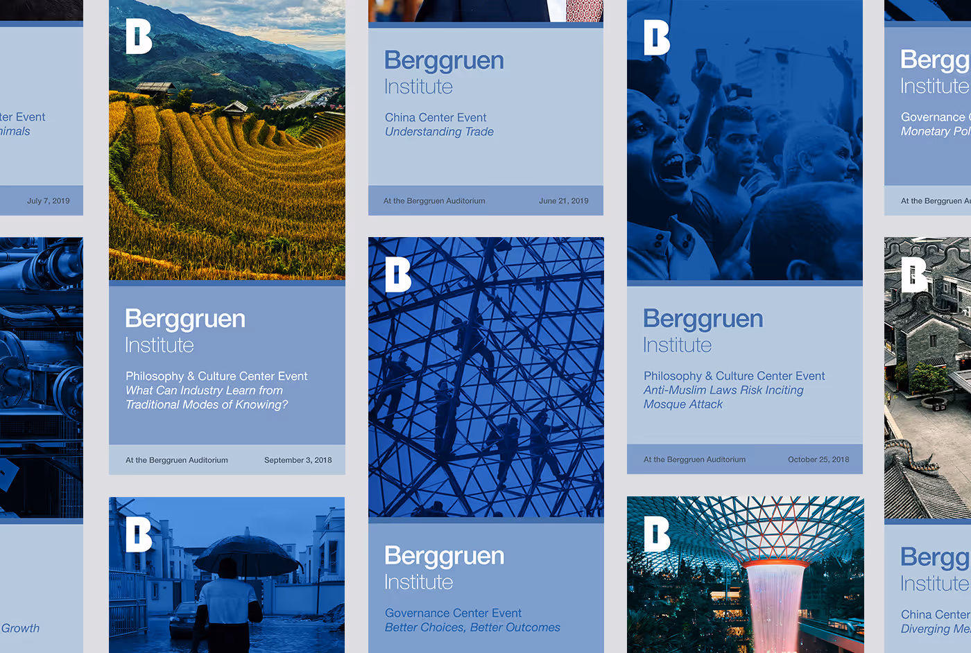
Founded by "homeless billionaire Nicholas Berggruen, the Berggruen Institute was created to foster and honor the important work of deep, innovative thinking around a range of issues. As such, the brand needed to have a sense of gravity, feel global in scope, and reflect the contemplative nature of those involved with the institute. It needed to point to the future but have a sense of constraint. From the start, we thought about the brand language as a whole and went through many iterations, finally resting on the idea of the logo as a window and color as panes of glass through which different perspectives could be represented. The negative space of the I in the B became a lens through which the world could be framed, making the mark, like the members of the institute, something that both lives in the world and reveals it.